
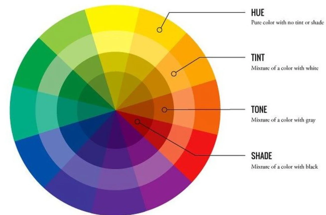
What’s a tint, a tone or a shade?
You may have seen my recent reels on colour theory as I am trying to help you all understand how a little knowledge can make using colour in your home so much easier. Firstly lets zoom in on colour value, tints, shades, and tones. These are the building blocks that help you create just the right vibe in your space.
Tints, Tones, Shades when using colour in your home
Tints, tones + shades are terms we have all heard, but you may not understand their real meanings. These terms describe how we play with a base hue (like yellow, purple, or orange) to get different variations:
Tints: These are like adding a dollop of white to your hue. Think sky blue (blue + white) or a gentle lavender (purple + white). Tints are generally lighter and often evoke feelings of softness and tranquility.
Tones: This is where we get a bit more subtle. Tones are created by adding grey to a hue. This softens the intensity and creates a more muted, sophisticated version of the colour. Think a calming sage green (green + grey) or a grounded taupe (brown + grey). Tones can feel very earthy, refined, or peaceful.
Shades: Just like adding a touch of mystery! Shades are created by adding black to a hue. Think a sophisticated navy (blue + black) or a rich plum (purple + black). Shades tend to be darker and can add depth and elegance.
Each colour has a Value
Ever noticed how the same colour, lets say green, can feel light and airy or deep and dramatic? That's all thanks to its value. Imagine a scale that goes from pure white all the way down to pure black. When using colour in your home it’s important to consider value.
High value colours are the lighter ones – think soft pastels like a mint green or sage.
Low value colours are the darker ones – like a rich forest green
Here’s another example - picture a vibrant red. Its high value version is a delicate pink, while its low value is a deep, almost burgundy hue. See how different they feel?
Using colour in your home or space in a cohesive way
When you're using colour in your home, think about how these elements work together. Do you want a light and airy feel with high-value tints? Or a cozy and dramatic vibe with low-value shades? Maybe a sophisticated and calming atmosphere with muted tones? My advice is actually to think about variety so your house has High, mid and low value tints which would in turn mean it has tints, tones and shades scattered throughout. This is a fantastic way to create depth, interest, and the perfect mood in your home.
Don't be afraid to experiment and see what combinations speak to you. If you need a bit of assistance, get in touch as I offer ‘pick my brain’ calls to help with colour choices, or get me in to design the full room palette.

Tints, tones and shades of blue
Different values of blue bring together this beautiful room. Look how well the tint of blue on the chairs pairs with the shade in the artwork and fireplace. Then the rug ties it all together in a tone of blue veering on grey.